Blackwater Breakers
About the Project
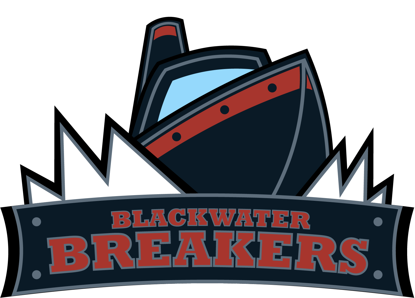
This brief came back darker than the last one. The Blackwater Breakers needed to feel like a franchise that existed somewhere real - not fictional-cool, but credible. A team from an industrial coastal port city with weather, with weight, with history written into the docks and the water. No pirate shortcuts. No cartoon waves. Something heavy, disciplined, and built to last.
The client brief was precise: aggressive but disciplined, industrial rather than futuristic, coastal without leaning nautical-cartoon. The visual references were atmospheric - steel hulls, cold water, storm warnings, dock lights cutting through the dark. The constraint list was equally specific: no anchors, no playful mascots, no gradients that the mark couldn't survive without.
Process
The challenge wasn't finding an aesthetic - the brief handed me one. The real risk was coherence. With so many atmospheric reference points pulling in different directions, the concern going in was scatter: too many focal points, too many ideas competing for dominance in a mark that needed to read clearly at two inches wide.
I committed to the direction anyway, leaning into the weight of it rather than simplifying away from it. Built around that tension. Let the form argue for itself.
The AI client didn't hesitate. They felt the aggression was exactly right - the theme thoroughly nailed. Where I worried about visual chaos, they read conviction and control. It was a useful reminder that clarity and complexity aren't opposites. A well-organized mark can carry significant visual weight without losing its center.
Color Palette
#0A1A26
#F2F6F8
#5E6E7C
#A7352D
#1F4E5F
Typography
- Bold condensed sans-serif - mechanical, angular character
Tools Used
- Adobe Illustrator
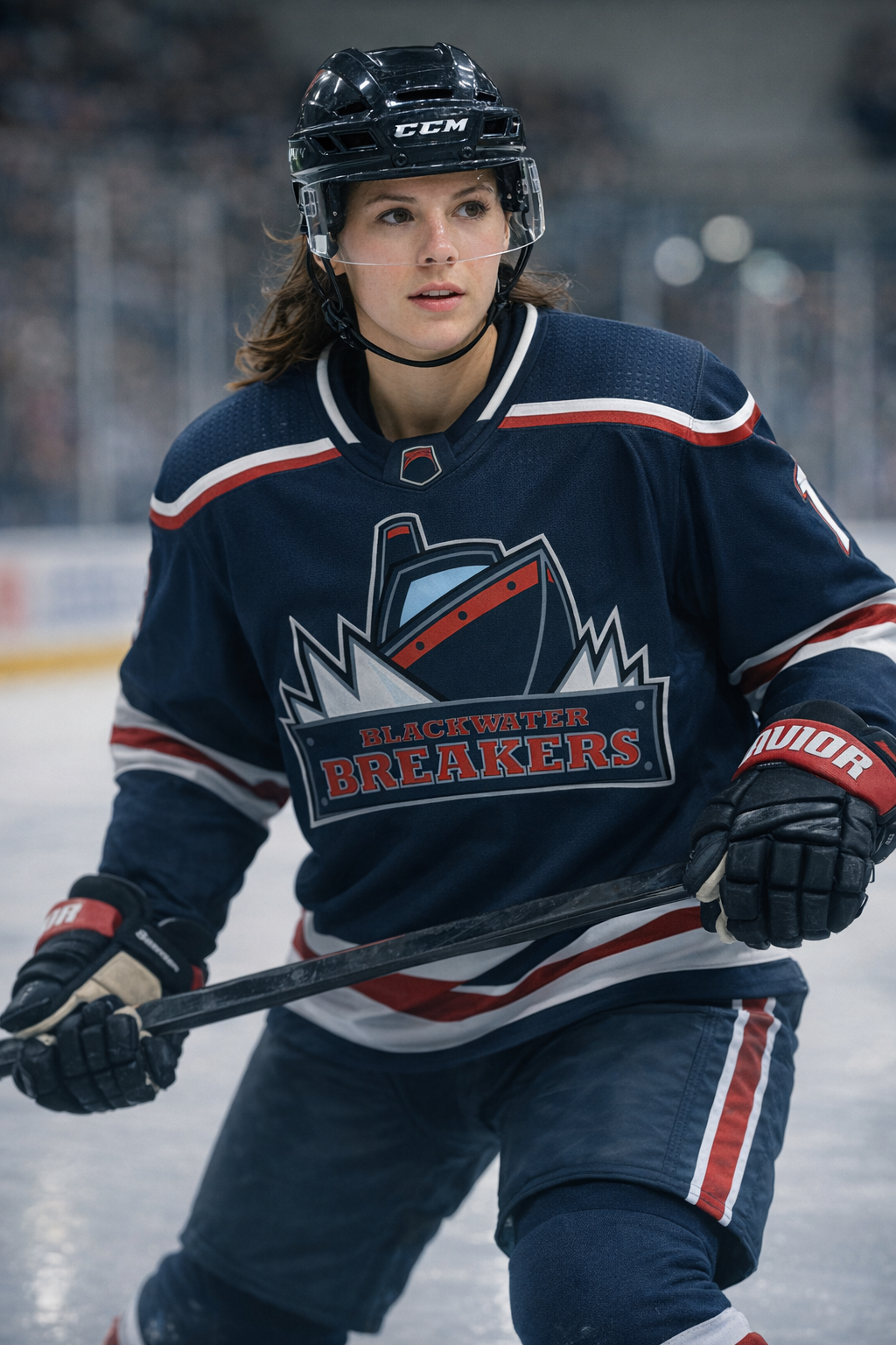
Concept rendering - logo on a jersey