Featured Works
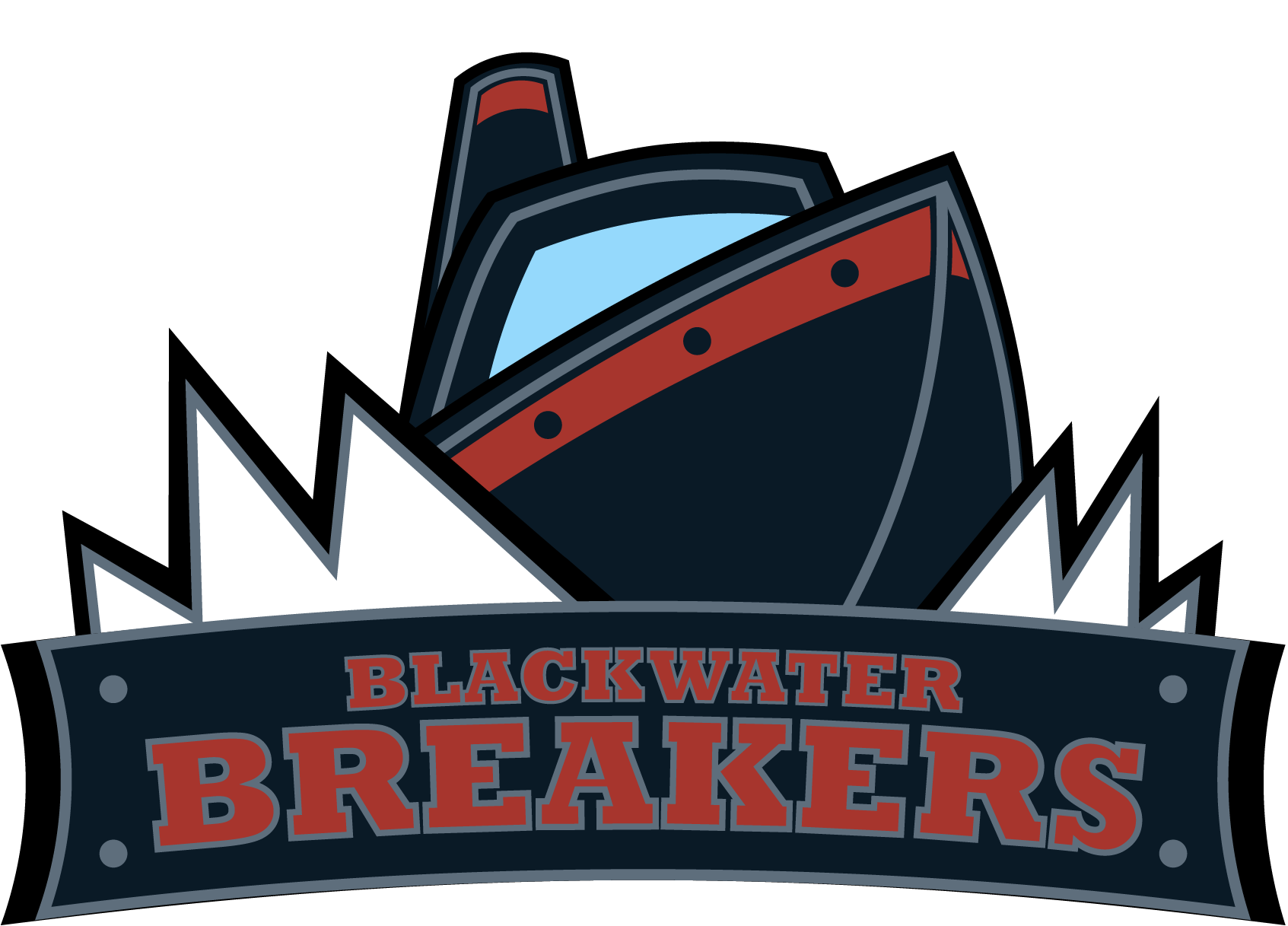
Blackwater Breakers
A professional hockey franchise identity rooted in industrial coastal grit. The Blackwater Breakers brief demanded something heavy and timeless — no pirate themes, no cartoon waves. Just cold water, steel hulls, and a mark built to intimidate from center ice.
Explore Project
FOCUS 05
A typography and layout exploration series. Three compositions, one directive: make the viewer stop. FOCUS 05 is about hierarchy in its purest form — where the eye goes, what it lingers on, and what it carries away.
Explore Project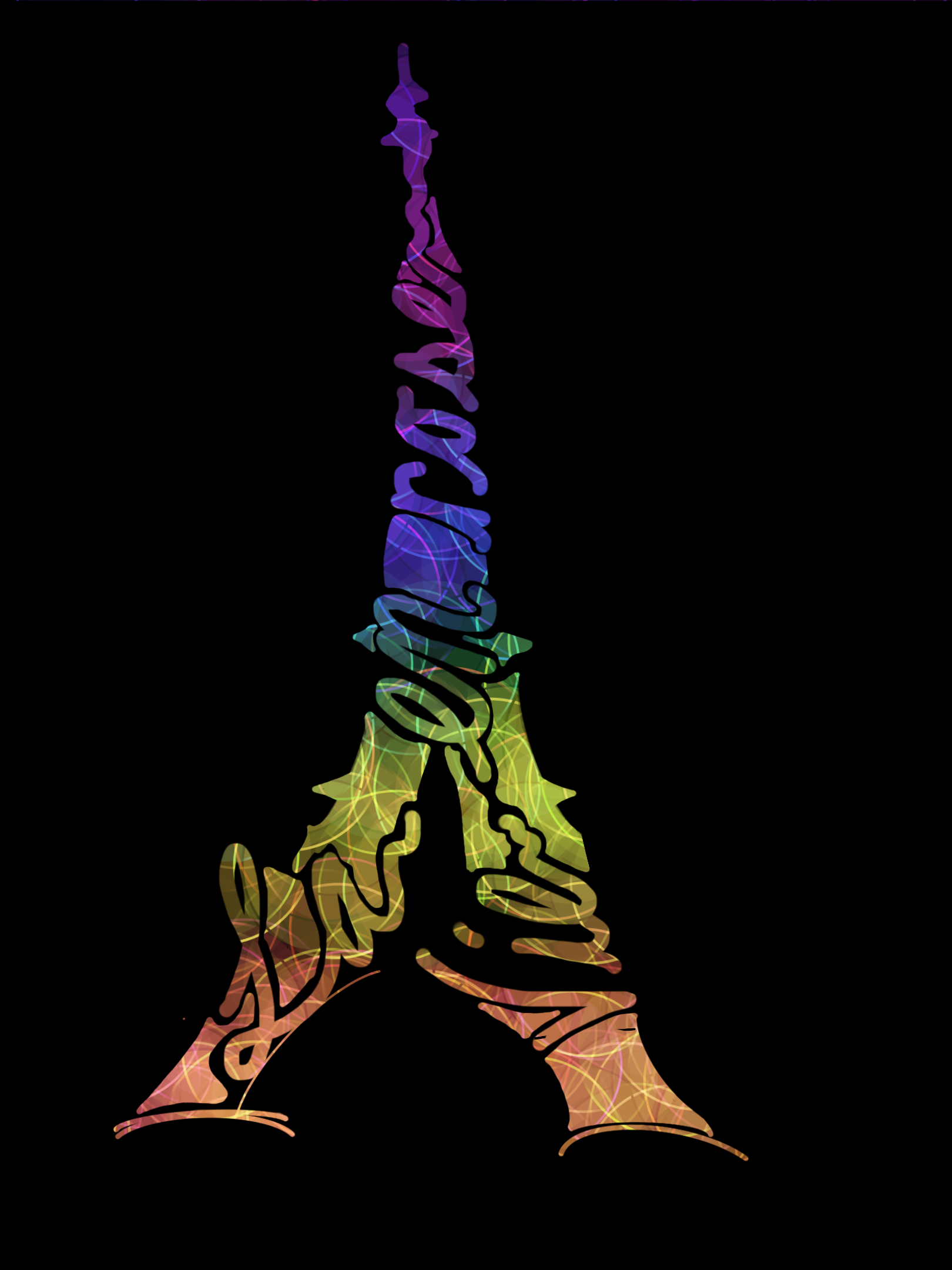
La Vie en Rose
A t-shirt design commissioned for a competitive percussion ensemble's 2018 season. The Eiffel Tower becomes the letterforms, and the letterforms become the tower — with the show's title hidden inside in the director's own handwriting, wrapped in a full light-show spectrum from ember to violet.
Explore Project.png)
My Letter to the World
A set of show posters and a finals flyer created for the Hagerstown Indoor Percussion Ensemble's 2025 season — the show that brought them back to IPA competitive finals for the first time in eight years. Two pieces, one message: what would you say if you wrote a letter to the whole world?
Explore Project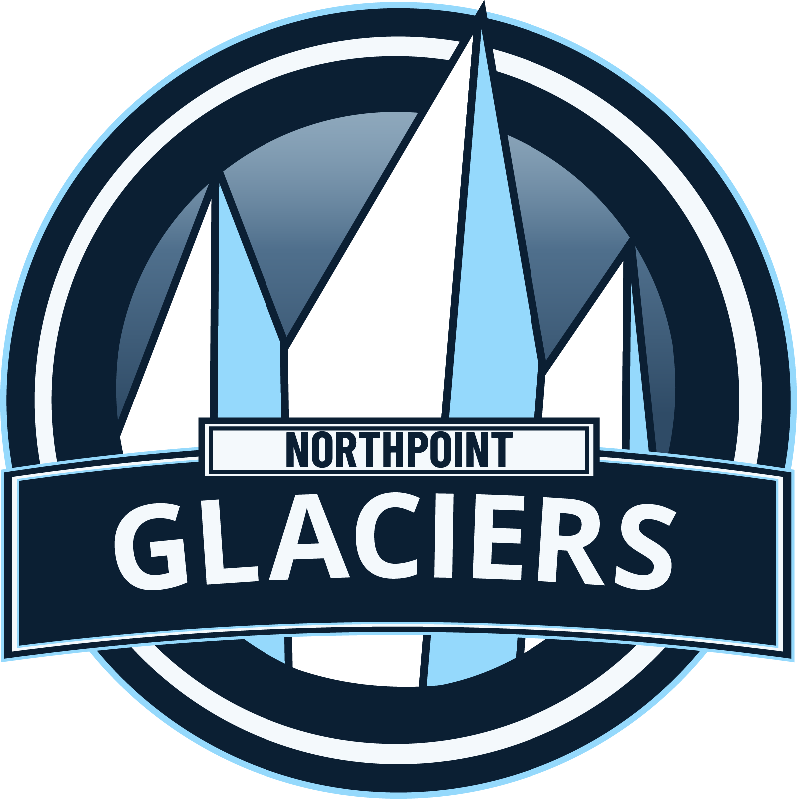
Northpoint Glaciers
A hockey team logo built around cold intensity and sharp aggression. The Northpoint Glaciers brief pushed me to iterate fast, take feedback seriously, and deliver something that felt genuinely dangerous on the ice. The jersey mockup brought the brand to life.
Explore Project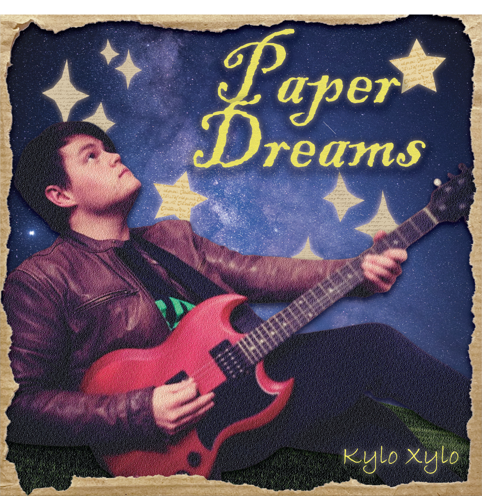
Paper Dreams
Album cover design for Kylo Xylo. The brief called for something that felt dreamlike but grounded — fragile, like something you could fold up and put in your pocket. Every element was chosen to carry that tension between the delicate and the lasting.
Explore Project