Northpoint Glaciers
About the Project
This project began with a deliberate constraint: I needed more reps designing logos under real client pressure. So I did what any resourceful designer would do - I built my own client. I prompted an AI to act as a creative director for a fictional professional hockey franchise and told it not to let me off easy.
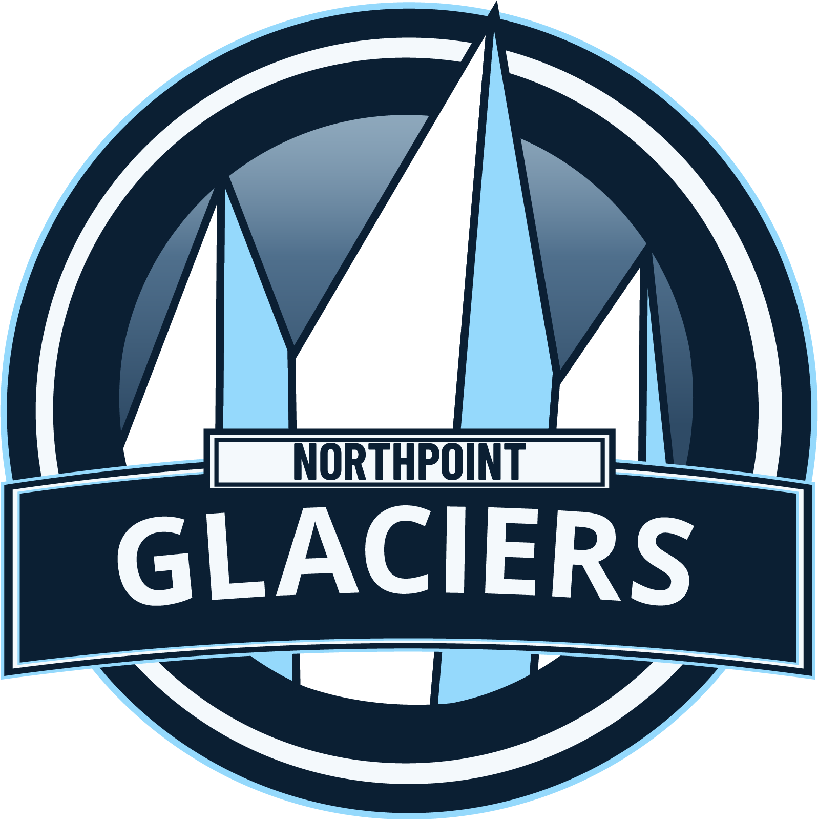
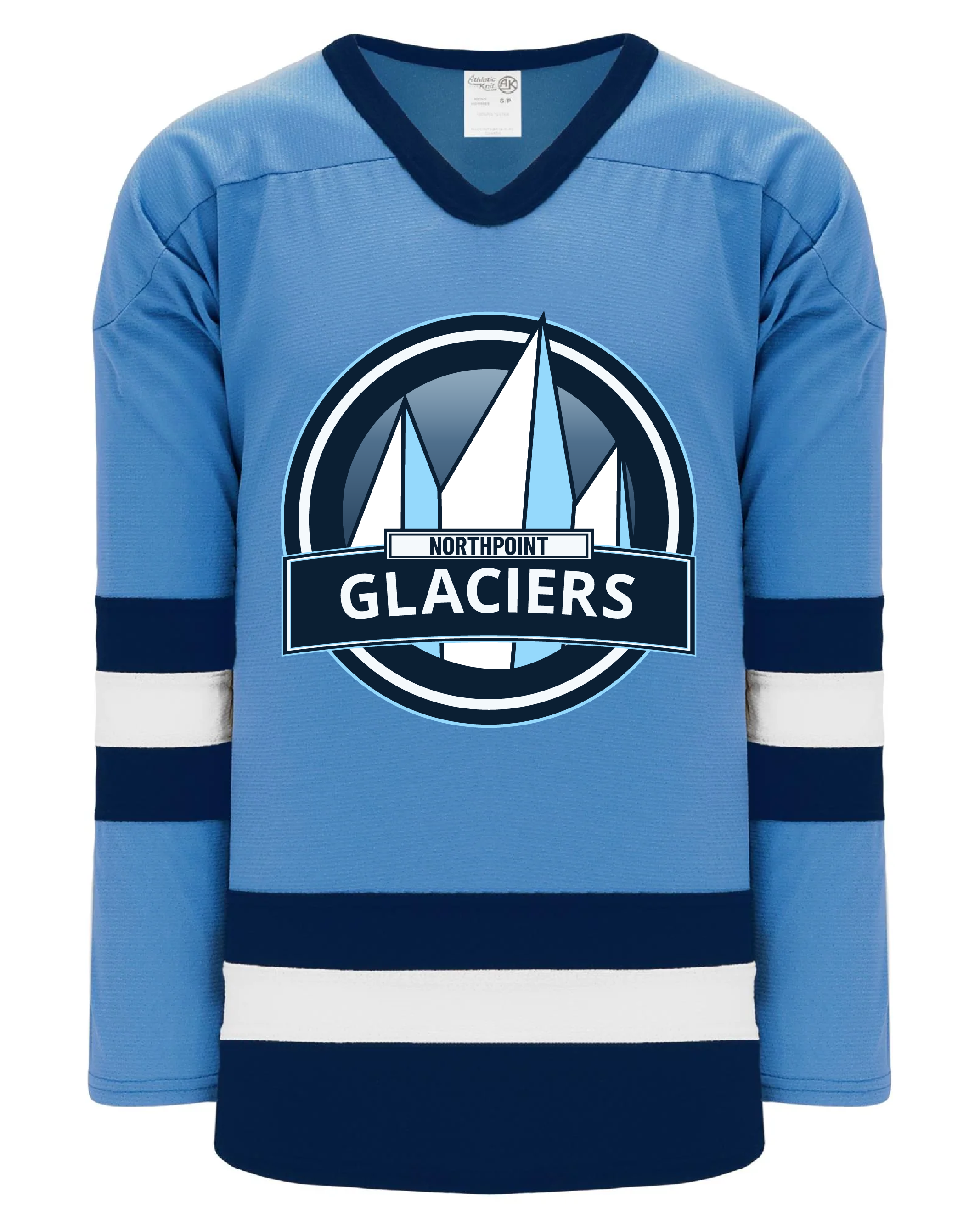
The brief came back cold and specific. The Northpoint Glaciers needed to feel like a legitimate franchise: dominant, resilient, and northern to the core. No cartoon mascots, no illustrative softness. Sharp angles, flat-friendly geometry, and a mark strong enough to hold up on a helmet decal, a jersey, or a social media avatar at 32 pixels.
Process - First Iteration
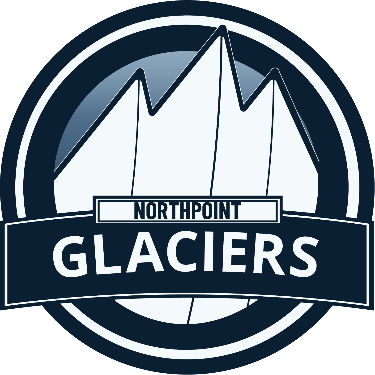
The first version wasn't a failure - but it wasn't right. The glacier peaks were too rounded, the overall shape too soft. It read as nostalgic regional-league logo rather than modern professional franchise. The background compounded the problem: a gradient bleeding from dark navy into bright purple, meant to evoke an aurora borealis. Atmospheric, maybe. Cold? Not even close. And when the brief explicitly ruled out neon tones, the pivot had to be fast and clean.
Color Palette
#0A1F33
#8FD3FF
#F4F9FF
#5C6E7F
Process - The Revision
Every critique from the first iteration became a directive for the second. The peaks were sharpened to hard, unforgiving angles. Depth was reintroduced by placing ice blue directly against frost white on the glacier faces - creating dimension and weight without reaching for gradients. The background went flat, dark navy: cold, unyielding, and unambiguous. The result felt ready for a real locker room.
Typography
- Open Sans Bold - GLACIERS
- Barlow Condensed - NORTHPOINT
Tools Used
- Adobe Illustrator