La Vie en Rose
About the Project
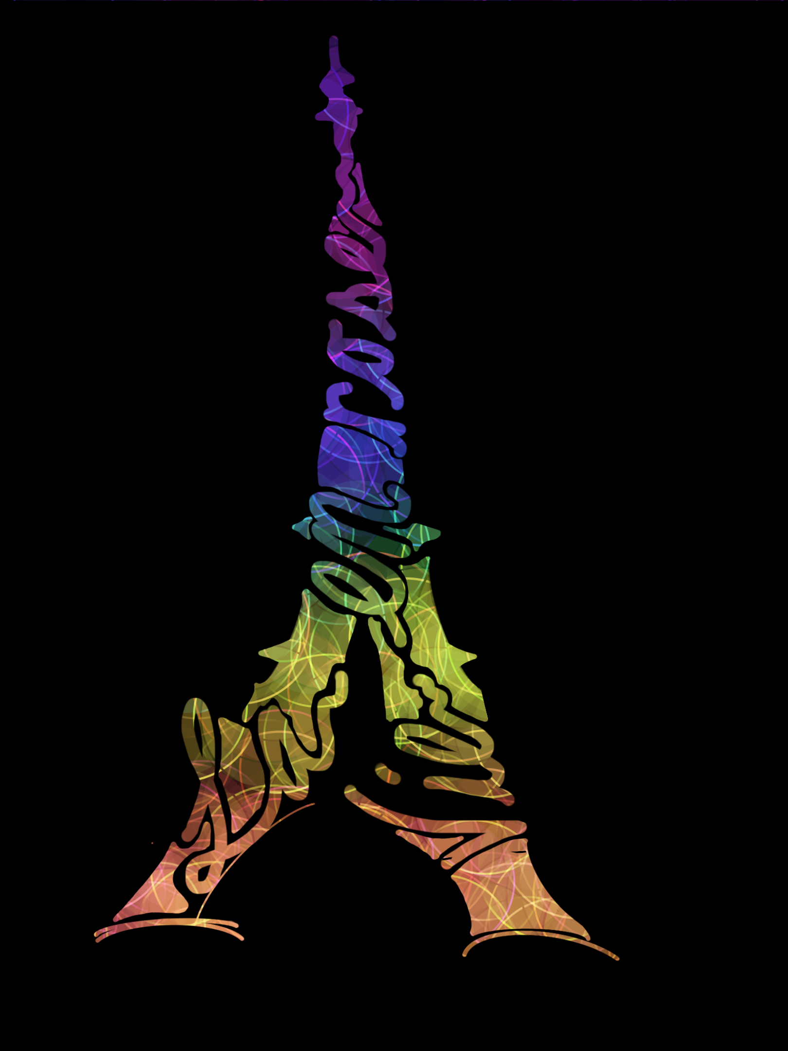
La Vie en Rose was a commission for a competitive percussion ensemble's 2018 season — a show built around the music of prominent French composers. The brief was minimal: the design should feature the Eiffel Tower somewhere. Everything else was open.
Open briefs come with their own kind of pressure. Without constraints to push against, the weight shifts entirely to the idea itself. Something merely competent would have been easy. Something worth wearing on a shirt through a full competitive season needed to earn its place.
The direction that emerged refused the obvious. Rather than depicting the tower literally, the tower became the letterforms, and the letterforms became the tower. La Vie en Rose spirals through the silhouette, rendered in the show director's own handwriting — something I specifically requested. Having him write the phrase himself brought an authenticity to the mark that no typeface could replicate. It made the design theirs in a way that mattered.
The color spectrum — climbing from warm amber at the base through citron yellow, spectrum blue, and deep violet at the crown — was drawn directly from Paris's famous Eiffel Tower light show: the nightly display that transforms the landmark into something alive with color.
Process
The process started at the sketch level. Many hand-drawn iterations — most discarded, some close — before a direction worth committing to surfaced. That's the part that rarely shows up in the final work: the volume of ideas that had to be generated and set aside before the right one appeared.
Once the concept crystallized, I rebuilt it digitally in Procreate, refining the forms while preserving the handmade character of the original drawings. The hand-lettered text within the tower silhouette was traced directly from the director's handwriting — a deliberate choice to ground the design in something personal and specific to the show.
After the director's approval, there was one more call to make: I recommended printing the design off-center rather than centered on the shirt. Centered placement would have made it feel conventional. Positioned to the side, it preserved the creative irregularity of the piece — reading as intentional rather than merely placed. The director agreed. The design went to print and served as the ensemble's official t-shirt for that season.
Color Palette
#0A0A0A
#C84820
#A8B018
#1878A8
#7022A8
Typography
- Hand-lettered script — director's own handwriting, traced and digitized
Tools Used
- Hand drawing (pencil & paper)
- Procreate
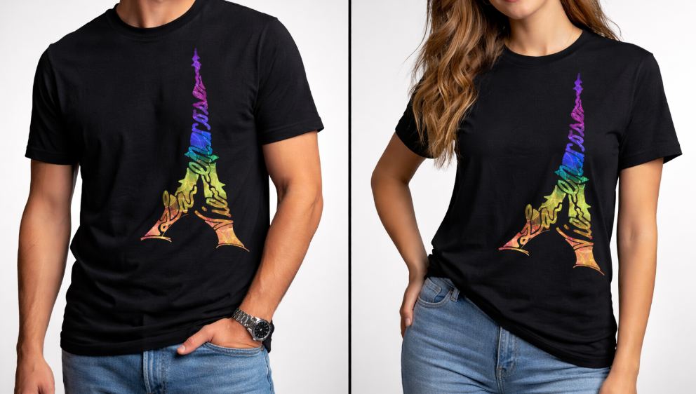
Design as worn — La Vie en Rose printed on the season's official ensemble t-shirt