FOCUS 05

About the Project
This was a classwork project to create a marketable advertisement. The brief put us in front of a real design problem: Focus 05, a restaurant whose advertising was pulling the wrong crowd. Their existing branding was speaking to an older, more conservative audience - but the brand wanted Millennials. Our job was to close that gap.
The deliverable: a subway banner ad campaign designed for a Millennial audience in New York City. Three concepts. Three taglines. One directive - make someone stop in two seconds.
Process - Empathize & Ideate
We started by going deep on the audience. Millennials aged 22–42 are tech-fluent, values-driven, and highly attuned to visual authenticity. They're not buying ads - they're buying experiences, stories, and brands that feel like them. Mood boards and mind maps helped us identify the fonts, imagery, and color language that would resonate: clean sans-serifs, earthy and natural palettes, photography that feels lived-in rather than staged.
The problem with Focus 05's existing advertising wasn't a lack of effort - it was a mismatch. Serif-forward layouts and muted, formal color choices were sending signals to the wrong demographic. Every design decision needed to be re-aimed.
The Psychology Behind the Design
Millennials are frequently mocked for their aesthetic sensibilities - the muted palettes, the minimal layouts, the relentless commitment to "clean." But there's a psychology behind it that goes deeper than trend-chasing.
Millennials came of age during sustained disruption: formative years shaped by cultural upheaval, economic collapse, and rapid technological change. The result is a generation with a deeply embedded, often subconscious need to feel current and validated - to belong to something alive and relevant. Their visual language reflects that. Simple, bold design commands attention without demanding explanation. It signals confidence. Muted, harmonious color palettes feel less like decoration and more like identity - a quiet way of saying I know what I'm doing in a world that has rarely made that easy.
For Focus 05, that psychology was the brief within the brief. The layouts needed to move fast and feel effortlessly current - the kind of design that reads as confident rather than constructed. The palette choices weren't accidents. They were a deliberate signal to a generation trained to notice the difference between a brand that genuinely understands them and one that's simply performing relevance.
Millennials flock to the places marketed to them because there, they are caught between no generations. They are not mocked by those older, nor dismissed by those younger. They can simply exist.
Color Palette
#9C3B4A
#F3F1EC
#C5D9CC
#7A8BAA
#D26F36
Process - The Two Concepts
Two distinct concepts emerged from ideation, each with its own tagline and visual identity:
"Style. Flavor. Focus." - Bold cobalt blue paired with hot-pink type and a circle-cropped portrait of a young woman looking off-frame. High contrast, urban, direct. It leads with attitude before it leads with food.
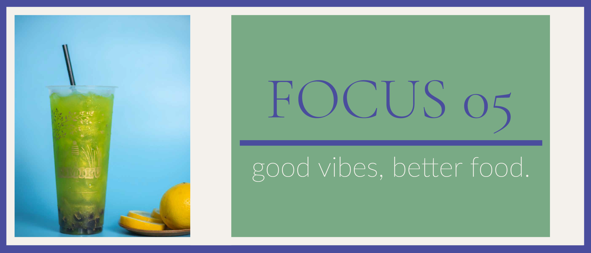
"good vibes, better food." - A bright green matcha drink anchors the left panel; sage green and deep indigo carry the right. Calmer energy, but still modern and intentional. This one invites rather than demands.
The files shown here represent the second and final iteration of each concept - refined after feedback to sharpen color contrast, strengthen visual hierarchy, and more precisely align each banner with the Millennial aesthetic we'd mapped in phase one.
Typography
- Lato Light
- Lato Heavy
- Futura Bold
- Barlow Condensed
- Avenir Next
Tools Used
- Adobe Illustrator
- Adobe Photoshop
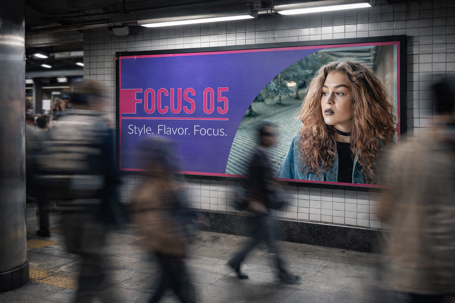
Concept visualization - Focus 05 banner ad in a subway environment