Color Study
About the Project
A three-part color study, completed in Photoshop. The same source photograph - a bicycle leaning against a wall - recolored three times, each following a different rule from the color wheel: analogous, complementary, and monochromatic.
The exercise was less about the final images and more about training the eye. Each palette had to be chosen with intent, then translated into the scene through careful masking, hue shifts, and color overlays. The same photograph - same composition, same lighting, same subject - reads as three completely different moods depending on which color rule it obeys.
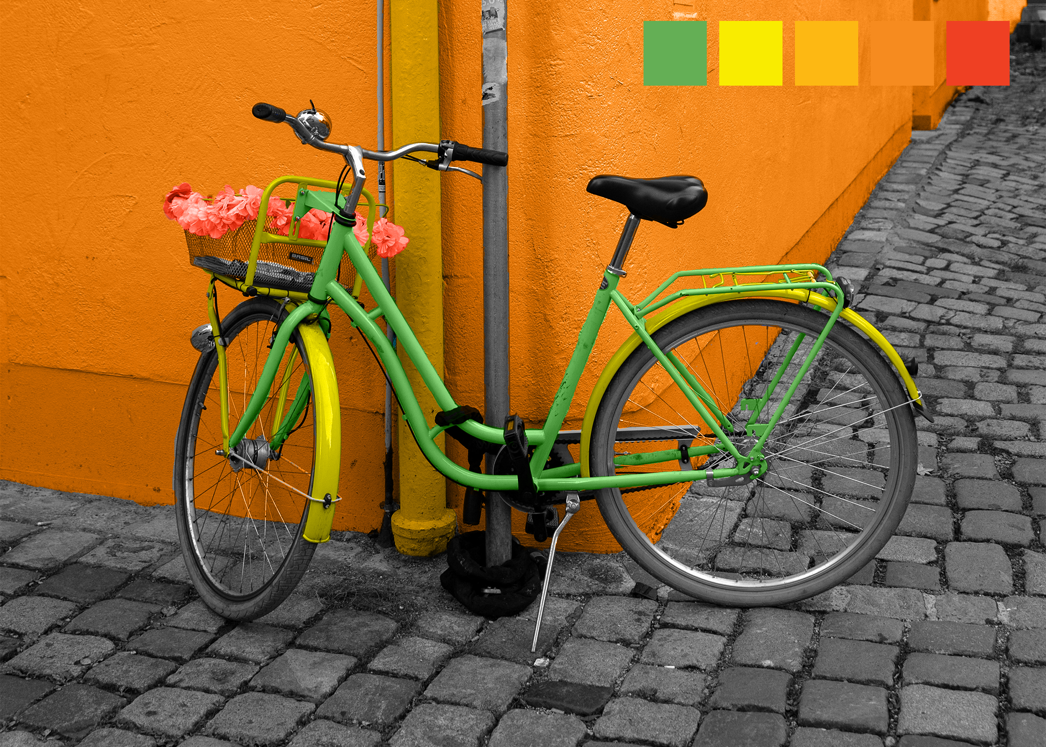
Analogous
An analogous palette uses three to five colors that sit directly next to each other on the color wheel. The harmony comes from their family resemblance - each color shares the underlying warmth or coolness of its neighbors, so the eye reads the composition as one continuous atmosphere rather than a collection of separate hues.
Here, the palette walks the warm side of the wheel: green frame, yellow fender, orange wall, coral flowers. No single color shouts; they hand off to each other like a slow breath. The result feels like a saturated summer afternoon - vibrant but never tense, because nothing is fighting.
Complementary
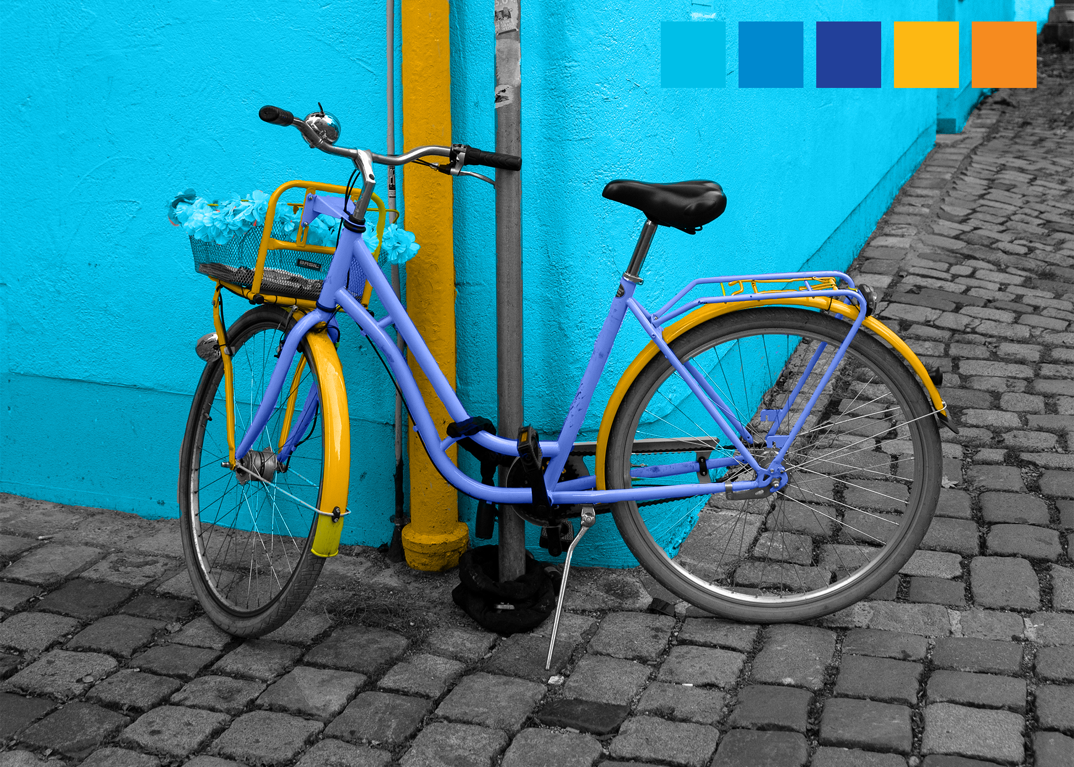
A complementary palette pairs colors that sit directly opposite each other on the color wheel - blue with orange, red with green, yellow with purple. The opposition is the point: each color makes its partner more intense, because the eye reads them as maximum contrast. Used well, complementary pairs generate energy. Used poorly, they vibrate uncomfortably.
This recolor pushes the blue/orange axis to its strongest reading. The cyan wall meets a saturated yellow-orange fender, and the violet-blue frame anchors the contrast without dampening it. The desaturated gray cobblestone foreground gives the eye somewhere to rest, so the bold contrast lands as confident rather than chaotic.
Monochromatic
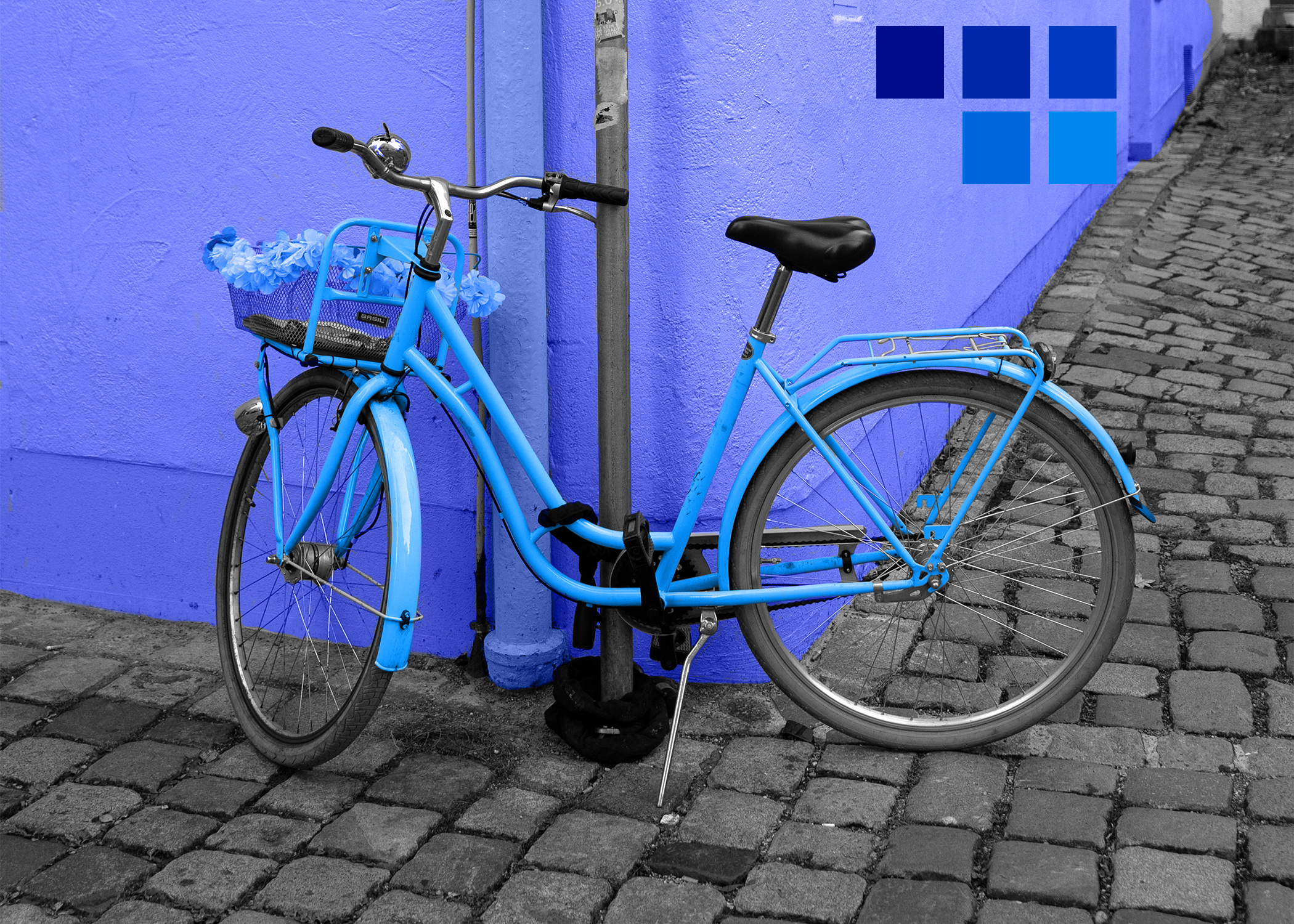
A monochromatic palette uses a single hue and explores it across multiple values and saturations - light to dark, dull to vivid, all variations of one color. Without other hues to provide contrast, hierarchy must come from value: lighter tones recede, darker tones dominate, and the entire composition feels unified and quiet.
Every recolored surface in this version is blue. The lavender-leaning wall sits as the lightest value, the medium cyan-blue bicycle holds the midtones, and the deeper blue accents in the basket and shadows anchor the bottom. There's no escape into another hue - only depth, light, and tonal variation within the same color family. The result reads as immersive rather than monotonous: a single color committed to fully.
Tools Used
- Adobe Photoshop