FutureFunds
About the Project
FutureFunds was a UX/UI redesign project completed in Figma as part of an SNHU course. The brief was built around a scenario: take user feedback collected on the company's existing site - confusion, friction, abandoned tasks - and translate it into a redesign that would actually serve a young professional audience. Then build out both a desktop and a mobile version of the result.
The course's real purpose was to introduce Figma in depth. Alongside the Adobe Creative Suite, Figma has become a standard part of the graphic designer's arsenal - especially for digital and product work. Getting hands-on time inside it, building components, managing layouts, designing for two breakpoints at once, was the real deliverable. The site was the proof.
Desktop - Hero
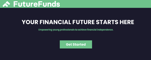
The hero leads with one clear promise: "Your Financial Future Starts Here." No marketing fluff, no industry jargon - a single sentence that names the value, a single sentence of support beneath it, and one call to action. The green button stands out against the deep navy, the only saturated color in the immediate hero space. The eye lands on it without effort.
Desktop - Below the Fold
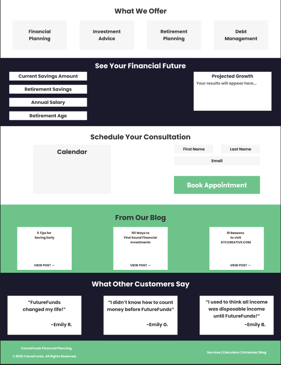
Below the hero, the page is organized into clearly defined zones. "What We Offer" lays out the four service pillars in equal-weight cards on white. "See Your Financial Future" lets the user plug numbers into a projection calculator without leaving the page. "Schedule Your Consultation" makes booking immediate rather than a multi-click journey. Blog highlights and customer testimonials close the page on trust signals.
Each zone uses a distinct background color - navy, white, green - so the user always knows what kind of content they are looking at before they read a word. The alternation also keeps scrolling from feeling repetitive.

Mobile
On mobile, the same content holds together by stacking. Service cards become a vertical list with full-width tap targets. The calculator inputs reflow to a single column. Nothing scales down in a way that loses meaning - the hierarchy holds, just oriented differently.
The mobile version is built for the same trust-building flow as the desktop, with thumb-friendly spacing taking precedence over visual density. Every interactive element is sized for an actual finger, every reading line is set for a thumb-held device, and nothing important gets buried beneath unnecessary scroll.
Color Palette
#1A2138
#7AC57D
#FFFFFF
#EEEEEE
Typography
A single clean modern sans-serif carries the entire site - heavy weight for the headlines that need to anchor each section, regular weight for body and supporting copy, and a lighter weight for fine print and form labels. One typeface, three voices, all friendly.
Financial brands often reach for serif type to signal heritage and trust. FutureFunds is built for an audience that does not associate seriousness with stuffiness - so the type stays approachable, the rhythm stays tight, and the brand feels like a partner rather than an institution.
Tools Used
- Figma