Echoes in Beskar
A Note Before You Read
Star Wars is an intellectual property of The Walt Disney Company. I am in no way legally or financially affiliated with The Walt Disney Company, Lucasfilm, or the Star Wars franchise, aside from being a lifelong fan of the universe. This is a fan-made book cover designed as a Southern New Hampshire University project. No part of this work is intended for commercial use.
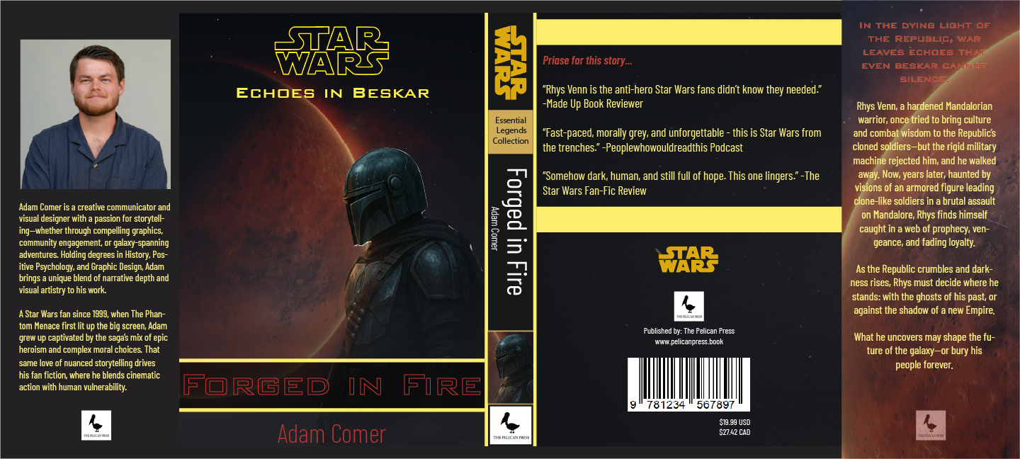
Full book cover spread - back, spine, and front
About the Story
Echoes in Beskar is a fanfiction book cover designed for an original story following Rhys Venn - a hardened Mandalorian warrior making his way through the fractured galaxy left behind by the collapse of the Empire.
Conscripted by the New Republic to hunt down Imperial holdouts and bring order to scattered systems, Rhys finds the deeper he travels into the Empire's old rim, the harder it becomes to tell who the real enemy is. The cover is built around that ambiguity: a lone figure, weighted armor, and a planet burning behind him - everything he's been told to fight against, and everything he's quietly starting to suspect about the cause he serves.
The deeper the journey, the more truths Rhys uncovers - about the war, about the people who sent him into it, and ultimately about himself.
Design Direction
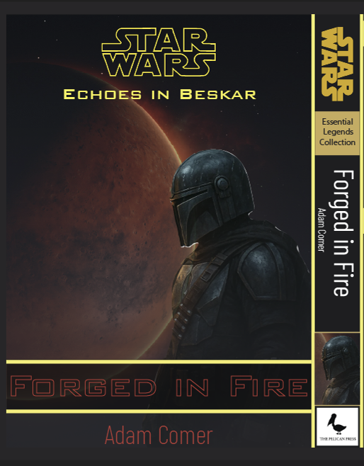
The brief I set for myself: this had to feel like a real published novel, not a piece of franchise merchandise. Star Wars marketing tends toward action and ensemble - bright lights, multiple characters, dramatic taglines, slanted display type. Novels in the genre take a different approach: a single iconic image, classical typography, atmospheric composition. Think Dune. Think Foundation. The kind of cover that earns its shelf space without shouting.
The Mandalorian figure stands alone against a burning planet - quiet, weighted, ambiguous. The title typography sits in classical proportions rather than the slanted Star Wars house style. The "Forged in Fire" tagline picks up its color from the planet behind. Every element was chosen to make this object feel like something a reader would pick up in a bookstore, not something they'd see on a poster in a theater lobby.
Color Palette
#1A1614
#B72E1A
#E6A24C
#6B7178
#ECE2C9
Typography
Three voices, working together. The "STAR WARS" mark sits at the top in its standard franchise lockup - the only piece of the cover that obeys the house style, because it has to. Beneath it, "Echoes in Beskar" is rendered in a classical serif with generous tracking and a soft glow - intentionally restrained, the way a published novel would title its series.
At the bottom, "Forged in Fire" takes a different tone entirely: a heavier, distressed display face washed in the same ember red as the planet behind the figure. It anchors the front cover and gives the title a tactile weight - iron, scorched, beaten into shape.
Tools Used
- Adobe Photoshop
- Adobe InDesign